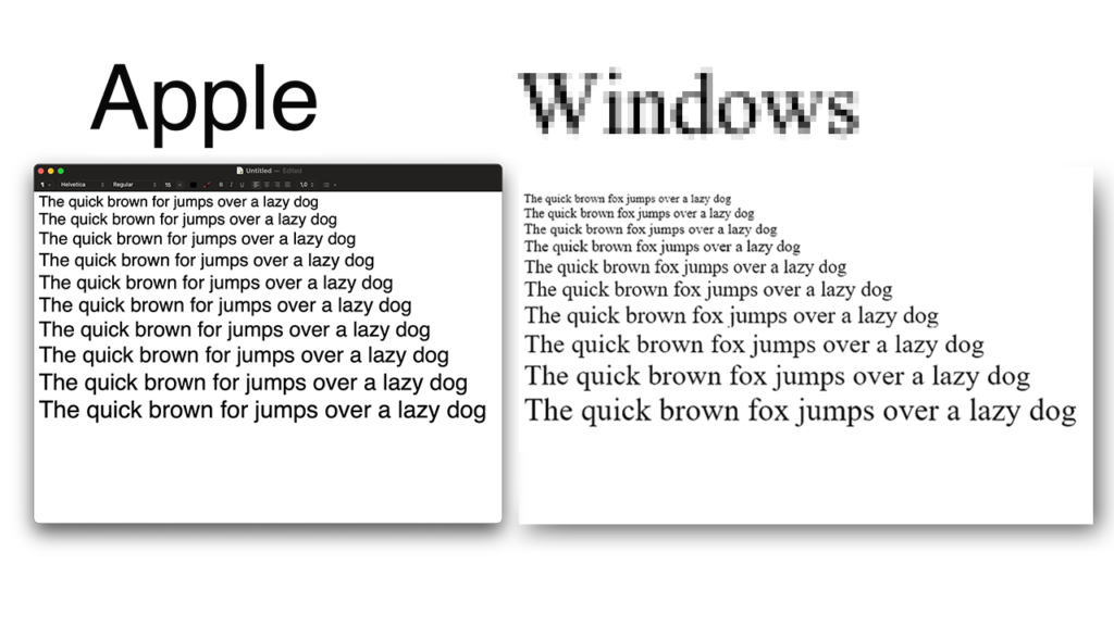
Have you ever sat close by and looked at a Windows and a Mac monitor side by side?
Have you noticed the subtle difference in how the fonts appear on each of them?
I have.
And from looking closer I came to the conclusion that fonts on Mac look much better than on Windows.
No doubt, that’s just my subjective opinion.
Of course, maybe you don’t have two operating systems and you watched a YouTube video about cool Mac apps but then noticed that fonts appear so much better on a Mac.
That’s exactly what happened to me.
I wanted to find out why that is.
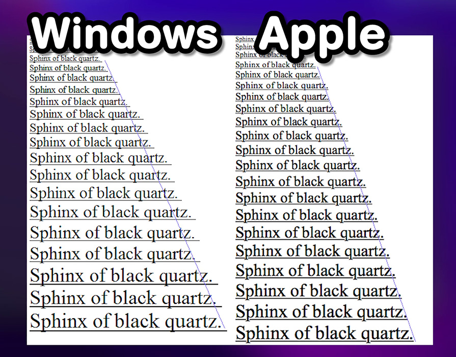
Take a look at the picture below.
This is how the text looks on MacOS compared to Windows.
I took this screenshot on the same monitor with the same font and font size and in the same Microsoft Word application. The only difference was the OS:
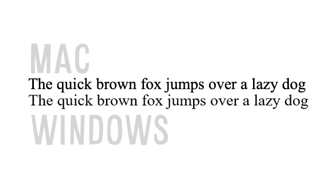
Even though the font and the app stayed the same the difference in both of these sentences is still visible.
On Mac, it looks as if the text is a little bolder and rounder.
And on Windows, the letters are more spread out.
It almost looks like Mac has this smooth, nice font rendering that is extremely pleasing to the eye and Windows just couldn’t be bothered to make it less pixelated and harsh.
At least this is what I think.
In order to see why this is the case we have to look at something that’s called font rendering.
Mac OS and Windows have different engines for rendering fonts and that’s why their text comes out looking different on the screen.
But why?
Why Fonts Look Better on Mac Compared to Windows

There are two reasons why Fonts tend to look nicer on Mac compared to Windows.
It has to do with the intention behind font rendering and hardware:
Mac renders letters with the intention of making them look as close to real life as possible. Windows focuses on accuracy and placing letters exactly in the grid of pixels so they appear sharper.
1. Intention behind font rendering
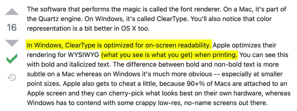
Well the short answer is that Windows, like the majority of people, don’t really care about how beautiful font looks on their screen, rather they care about how readable it is and how accurately displayed it is.
But Apple – is the complete opposite.
Whilst Windows renders fonts with the intent of making the letters more clear Mac renders the fonts to be more true to how they would look in a printed book.
In other words in Windows, the text is optimized for on-screen readability.
And on Mac, the rendering is done as what you see is what you get when printing.
2. Different hardware where fonts are displayed

Especially at smaller font sizes, Apple gets to cheat a little because most Macs are attached to an Apple screen.
Apple can cherry-pick what looks best on its own hardware, whereas Windows has to contend with some crappy low-res, no-name screens out there.
That’s why Mac OS’s sub-pixel anti-aliasing makes text look a lot smoother, especially at medium font sizes.
However, if you connect a Mac to an external monitor the fonts don’t look as nice anymore.
But the differences are very subtle.
If you’ve never noticed the differences in fonts on both of these operating systems here’s a video showcasing them and explaining things in more detail:
Which operating system has better font rendering?
Naturally, the question of which way is better comes up.
So of course there are pros and cons to each of the font rendering methods.
The Apple way may appear nicer on the screen but it’s not consistent.
Because Apple wants the letters and words to be formed as accurately to real life as possible, if the spacing between letters is not accurate, the OS simply tries to adjust the font.
So for instance two of the same letters put together on a Mac may not be of equal thickness.
And because Windows do not perform this adjustment the letters have the same thickness but tend to line up slightly less consistently with bigger or smaller gaps between them.
Windows’s priority is to keep the text accurately placed in the grid of pixels to keep it as sharp as possible.
Whilst Mac focuses on aesthetics rather than accuracy.
Was this guide on why fonts look better on Mac compared to Windows useful?
I hope that this guide helped you better understand the subtle differences between MacOS and Windows.
And a list of the best Mac apps to install.
Thanks for reading 👋!