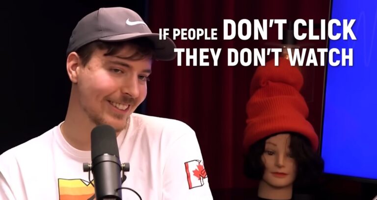
“If people don’t click, they don’t watch” – Mr.Beast
So you decided to write an amazing script for your YouTube video, recorded the voice-over and b-roll, edited the video and now there’s one, arguably the most important piece missing – the thumbnail.
“It’s a lot easier to get 5 000 000 views on 1 video than to get 50k views on 100 videos. It takes much less effort.” – Mr.Beast
The thing is, if you’re good at graphic design that doesn’t mean you’re good at thumbnail design – it’s an entirely different ball game.
Some creators can come up with a viral thumbnail in 10 minutes and create it using Microsoft Paint or Canva.
And others upload 100 videos with thumbnails that are made with advanced creator tools like Photoshop but have a 1,7% CTR.
That’s why I want to share 9 tips on creating better YouTube thumbnails regardless of which graphic design software you use.
9 tips to make a Killer YouTube thumbnail like Mr.Beast
1. Contrast is king
One of the biggest beginner mistakes when creating a YouTube thumbnail is making every color extremely saturated.
This makes the thumbnail a huge mess and nothing stands out.
Here are the best tips for working with color in your thumbnails:
- Don’t make everything too saturated: only the important objects in the thumbnail need to pop.
- Contrast is king: aim for contrast in your thumbnail because if every part of it is standing out then none of it is standing out.
- Use complementary colors: complementary colors are those that are opposite of each other in the color wheel.
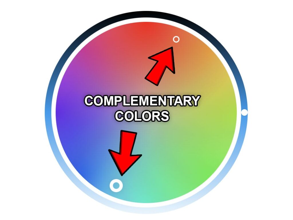
- Increase the saturation of the main object only: if the background of the thumbnail has little color then the object with the most color will stand out more.
Example of this in action:
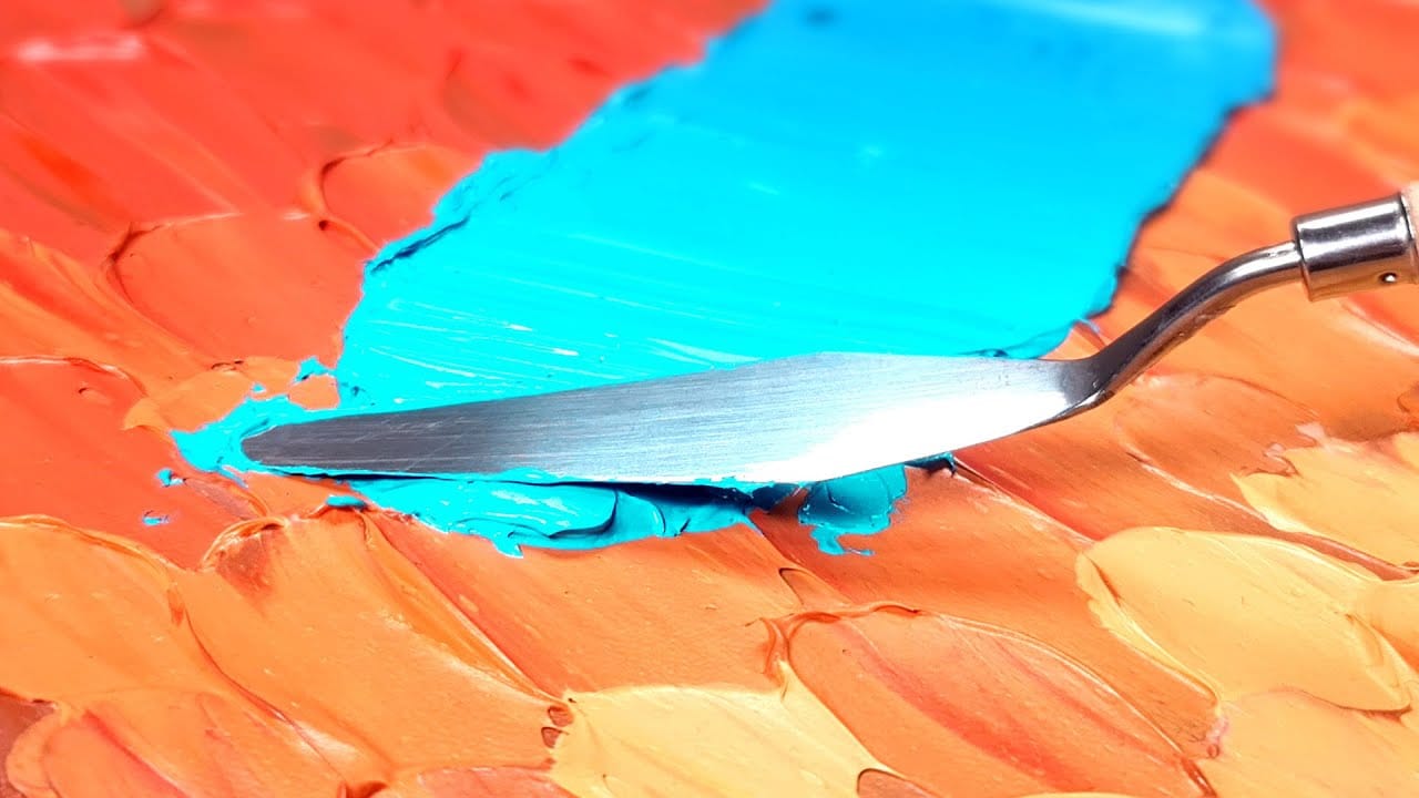
This thumbnail by a YouTuber Jazza has 2 complementary colors: blue and orange.
The orange in the background is not oversaturated so as to make the blue stand out more.
It’s a good example of the use of colors to make the thumbnail stand out among the rest.
2. Don't repeat the title

Another big beginner YouTuber mistake is to repeat the title in the thumbnail.
The thumbnail should complement the title and not be its copy.
Most viral videos on YouTube usually introduce intrigue in the thumbnail so the viewer looks at the title for more information.
Then the title goes even deeper into the subject but still leaves something to be desired.
That’s why the viewer clicks to find out the missing piece.
Also, you have very limited space to let the viewer know what to expect from the video.
So repeating the title in the thumbnail is just wasted space.
3. Have only 2 or 3 main elements
This is what Mr.Beast had to say about one of the thumbnails of Yes Theory.
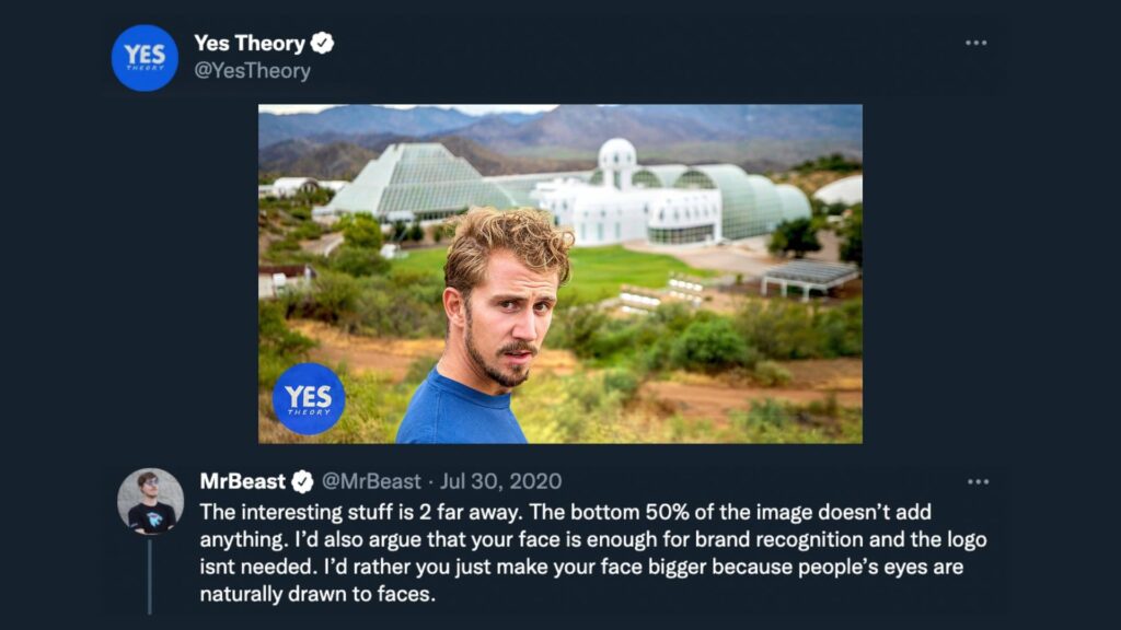
One more crucial step to making your thumbnail stand out is to include 3 main areas of focus at most.
Text counts as an element too.
If your thumbnail is cluttered with text, graphics, emojis, people, arrows, and a complex background then the viewer will see a blob of mess when the thumbnail is displayed to them on a small screen.
If you have a tiny object in the background of the thumbnail then a bright red arrow can help with highlighting it to the viewer.
Popular YouTube thumbnails usually include:
- A person’s face, an object, and text.
- A person’s face, an object, and an arrow.
- A background, a person in the foreground, and an arrow.
- An object and an arrow.
- 2 people and an object.
- 1 Person and the background.
- Object and text.
- 2 Objects.
Example of this in action:

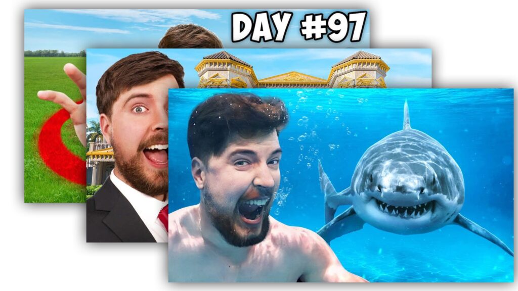
This thumbnail by Mr.Beast perfectly encompasses the rule of simplicity.
There are 2 main objects here – him and the shark.
This thumbnail is easy to understand at first glance and leaves the viewer completely sure of what to expect from the video.
It has no unnecessary background elements, no unnecessary text, and no clutter and that’s why it stands out amongst the rest on the YouTube homepage.
4. Don't waste space - thumbnails are small
This is what Mr.Beast had to say about one of Colin and Samir‘s thumbnails on Twitter.
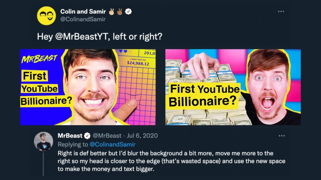
When designing your thumbnail you have to keep in mind that the viewer will always see a small version of your thumbnail.
If you’re using Canva or Photoshop to design your thumbnail, then you can zoom out to see how it would look when displayed on YouTube.
Alternatively, you can send the thumbnail to your phone and see how it would look like on a smaller screen.
If you zoom out and can’t make out what the thumbnail is, you should consider changing its design.
Example of this in action:
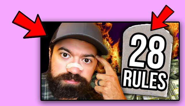
A thumbnail by Alex Harmozi.
This video has more than 500 000 views.
There are two main elements in the foreground of the thumbnail – him and a tombstone with 2 words.
The background has fire and money but that’s not going to be noticed by an average viewer because Alex’s face and the tombstone take up the vast majority of space.
So there are really 2 main objects here – him and the tombstone.
They take up 50% of the thumbnail each so there’s no wasted space.
This also brings me to the next point.
5. Use a maximum of 3 words of text in your thumbnails with a readable font
Just like having too many objects can make your thumbnail look like a mess – the same applies to the number of words.
A good thumbnail should have at most 3 words.
Otherwise, the text will become unreadable because it’ll be too small – especially for YouTube viewers on mobile.
Using bold fonts that are easy to read is a good idea.
The goal is to make the thumbnail as easy to understand for the viewer as possible.
If the viewer can’t immediately understand what the text says in the thumbnail then their eyes will gravitate toward the next video.
Here are a few ways to make text stand out:
- Make it bold.
- Don’t use “fancy fonts”.
- Add an outline.
- Add a drop shadow.
- Change the color of the text to make it stand out from the background.
Example of this in action:
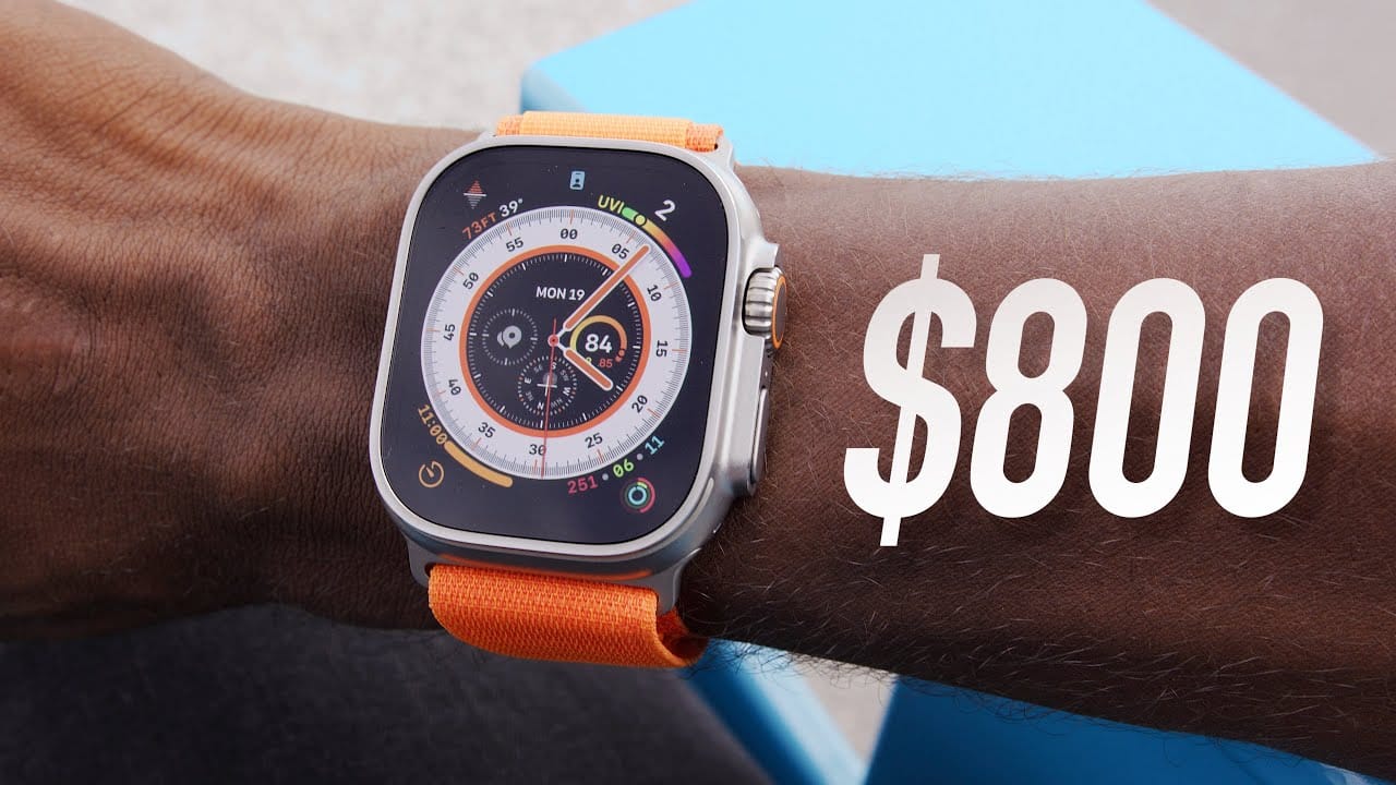
This thumbnail by Marques Brownlee is a good example of how you should use text in your thumbnails.
He doesn’t say “This cost $800″ or ” I bought this for $800″.
He just simply puts $800 – because that’s all that’s necessary.
And for the viewers who don’t know what $800 means, it creates intrigue.
It’s a win-win for MKBHD.
Following this example, you should put only the necessary text in your thumbnail and try to keep it below 3 words in total.
6. Don't put important objects at the bottom right
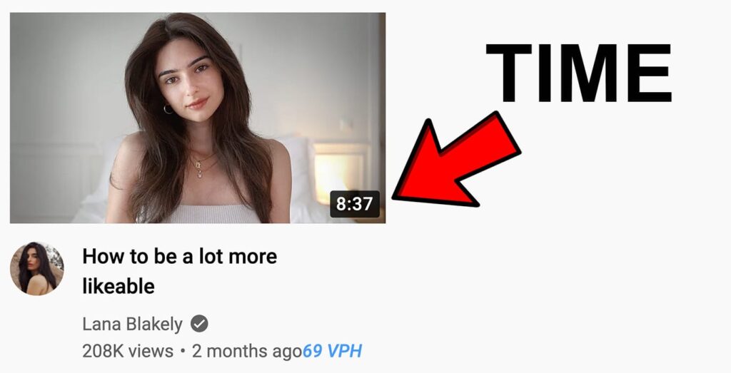
Don’t put small and important elements of the thumbnail in the bottom right because that’s where the length of the video is displayed.
The time will cover up that object and leave the viewer confused.
7. Introduce intrigue but don't clickbait
As Mr.Beast put it “thumbnails set the expectation for the video”.
That means that if your YouTube script or intro doesn’t deliver on the promise of the thumbnail – your video will die in the water.
A good thumbnail should introduce the main idea of the video but leave something out so the viewer still has the desire to click and watch the video.
Example of this in action:
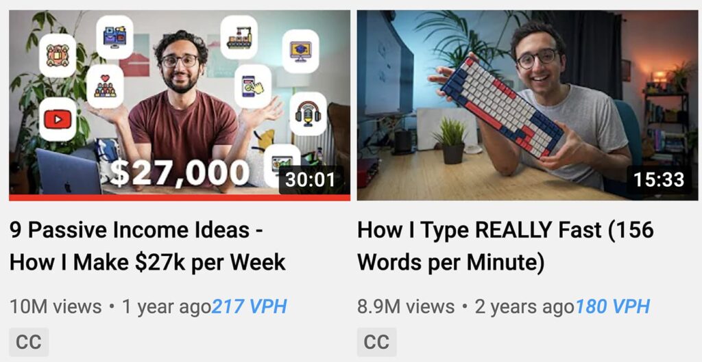
In the first video, Ali Abdaal introduces intrigue by showing that he makes $27000 per week.
The viewer naturally wants to find out how.
In the second video, the intrigue is in the how?
It gets you wondering how he is able to type really fast.
This is where the video title also becomes very important.
In these examples, it plays a crucial role in creating intrigue and getting the viewer to click.
8. Importance of Human Faces
Have you ever noticed that you can make out human faces from random objects that you see?
Humans have evolved over thousands of years in such a way so that they notice faces very effectively – faces attract attention.
You can exploit this human trait and include faces in your thumbnail which will make it more likely that the viewer will notice it among all other YouTube videos surrounding it.
Example of this in action:

In this example, Mr.Beast’s face takes up 1/3 which is less than it usually does in most of his other thumbnails.
This shows the importance of including a human face in your thumbnail.
A big face will attract the viewer’s attention and make him glance at the thumbnail.
From there it’s the other content of the thumbnail (like the Lamborghini in this case) and the title that’ll convince him to click and watch the video.
9. Create 2 or 3 thumbnails which are completely different from each other

“Typically, we like to create two to three versions of a thumbnail so that if a video doesn’t do so well we can swap it out” – Mr.Beast
You never know what your viewers might like.
That’s why having a backup thumbnail is great because you can switch it out if you see that the other one has a low CTR.
Creating more than one thumbnail, with a completely different idea behind it, will make you think more creatively.
To me, usually what happens is that the second one is always better than the first.
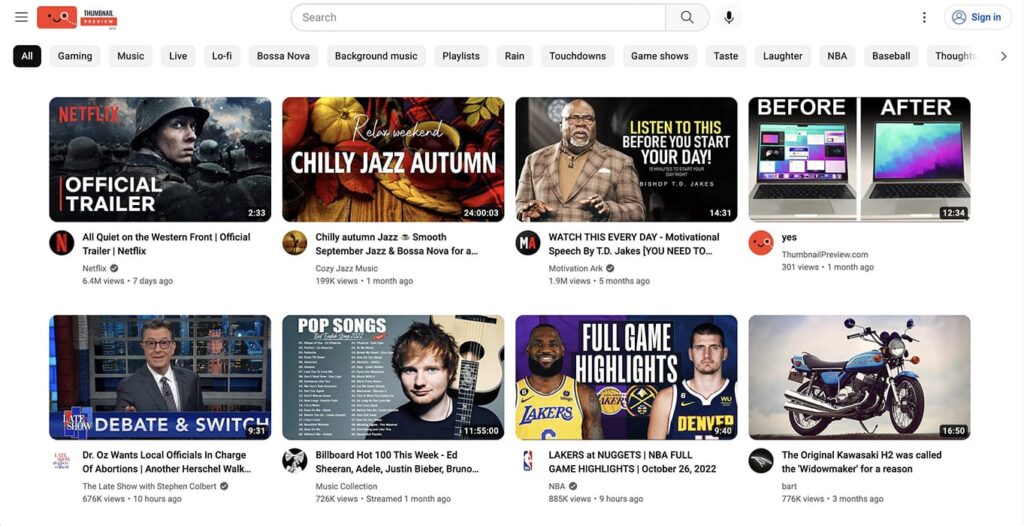
Before publishing your video, you can preview how your thumbnails will look on the dark mode and light mode of YouTube’s homepage.
You can Google “preview YouTube thumbnail” and find countless websites that let you upload your thumbnail and see it on YouTube’s homepage.
Understanding CTR
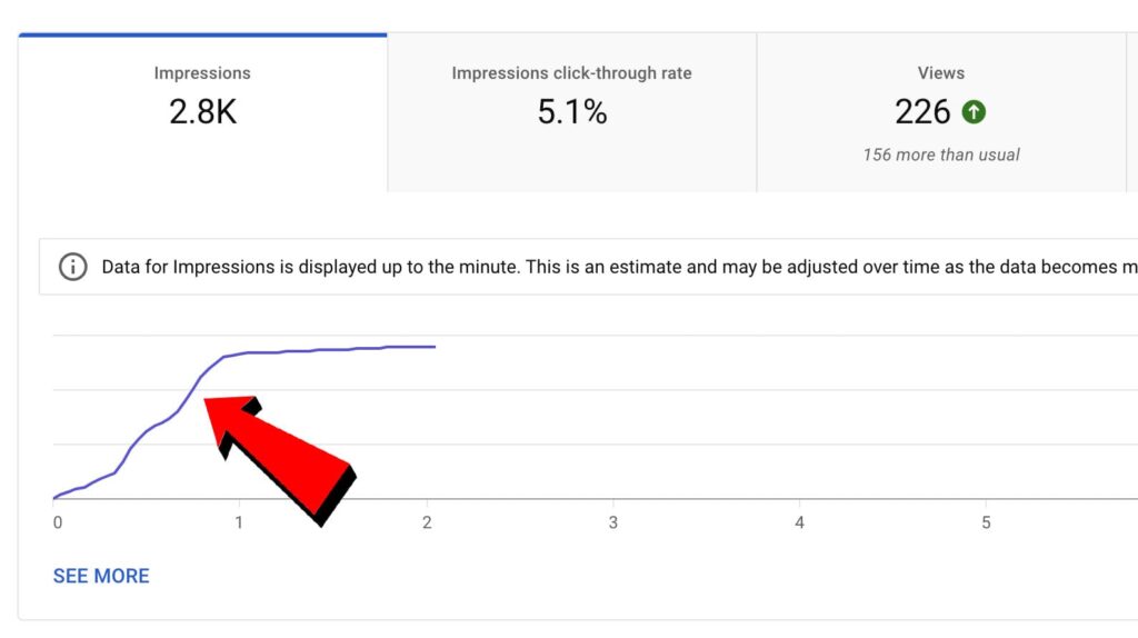
CTR stands for click-through rate.
It’s a number that shows the percentage of people who after seeing your thumbnail – clicked on it.
Why low CTR sometimes is good?
Sometimes if your video has a low CTR it doesn’t have anything to do with the quality of your thumbnail.
It shows that YouTube is pushing your video out to more people and seeing if they’re the right audience for your channel.
On the other hand, if your video has very few impressions and your CTR is low then you should probably consider changing up the thumbnail or title.
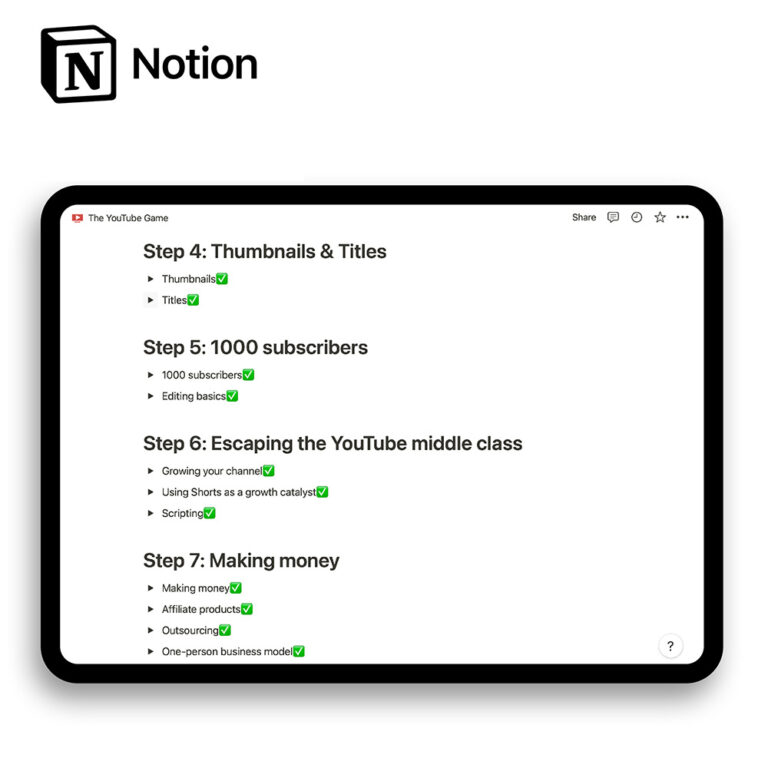
P.S. If you want to learn more about how to grow a YouTube channel from scratch I made this Notion template will everything that I know from growing a channel from 0 to over 14 million views.
Get a free Notion template with the tutorial for the game of YouTube
🚀 10+ Notion pages about how to play the YouTube game
⚙️ List of tools & gear for YouTubers
🧑⚖️ How to make your first video and get your channel off the ground
💰 Detailed guide about finding your niche & making money
What size should the thumbnail be?
Here are the best resolution and size recommendations for a YouTube thumbnail:
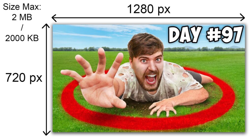
A YouTube thumbnail must be under 2MB in size and have a 16:9 aspect ratio. The best thumbnail resolution is recommended to be 1280×720 px.
Best software for creating YouTube thumbnails
How to learn Photoshop?
The best places to start learning Photoshop are YouTube and Skillshare.
I have a quick course on Skillshare with a bunch of Photoshop tips and tricks and if you want, you can check it out here.
I also put together a list of the most useful Photoshop keyboard shortcuts to make your photo editing workflow faster.
Canva:
Canva doesn’t have all the advanced tools that Photoshop has.
Nevertheless, with Canva you can still make great thumbnails because the idea of the thumbnail matters more than the software that it’s created with.
Even though Canva is limited in terms of how much you can do with it, it’s completely free.
It also has many free templates, objects, elements, text effects, and cool presets that make creating a thumbnail that pops out a lot easier.
You can draw inspiration from their templates and elements.
Whereas with Photoshop you only see a blank empty screen and you have to search for thumbnail inspiration elsewhere.
How to learn Canva?
YouTube and Skillshare are still the best platforms to learn new Canva skills for free.
There are countless tutorials and courses that will teach you to be better at graphic design.
Just type Canva in search and you’ll get plenty of online learning materials.
I’ve also made a quick and digestible Canva tips & tricks course on Skillshare and you can check it out here.
How to test if YouTube thumbnail is good or not?
There are a few good ways to test out if your thumbnail is good or not:
1. Use a thumbnail preview website
Thumbnail preview websites let you view your thumbnail on YouTube’s homepage without having to publish your video.
You’ll be able to compare and see if your thumbnail stands out among other channels that often appear on YouTube’s homepage.
2. A/B test your thumbnails:
You can do this yourself by switching out your old thumbnail to a new one and after 1 day see if the CTR is higher or lower.
Of course, when doing it yourself there’s a high margin for error.
That’s why you can use a YouTube SEO tool called Tubebuddy that has a thumbnail A/B testing feature built in.
I recommend reading my full TubeBuddy review here to see if it’s the right tool for you.

Was this YouTube thumbnail guide useful?
All in all, when creating a YouTube thumbnail make sure that it stands out among other videos by having good contrast, a maximum of 2-3 main elements with no more than 3 words of text, a human face, and no wasted space. A good thumbnail introduces intrigue and doesn’t repeat the video’s title.
The thumbnail is only 50% of the viral video equation, and the other 50% is watch time.
That’s why I made another guide just like this one about how to write killer titles for YouTube videos.
I’ll also leave you with some cool resources that will help you grow your channel and make more money:
How To Get 1000 Subscribers On YouTube
Best No-Face Niches For YouTube In 2023 (That Make Money)
9 Best AI Tools For YouTubers (Make Videos 67.1% Faster With AI)
Thanks for reading 👋!
